Introduction
Sharing the story behind the logo design for Niyathi Training and Content Solutions (NTCS) fills me with immense joy and pride. This project, close to my heart, embodies a true collaboration of vision, inspiration, and the remarkable talents of designer Logesh Prasaath R V. Here’s a glimpse into our creative journey.
Inspiration: Hridaya Kamalam
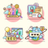
The journey began with a spark of inspiration from the traditional rangoli pattern “hridaya kamalam,” symbolizing prosperity. I aimed to create a logo that reflected the core values and the essence of NTCS’s services. This initial concept laid the foundation for a design that would visually communicate our mission and values.
Concept Development: Yin and Yang
Collaborating with my mentor, we explored various ideas and arrived at the perfect concept: Yin and Yang. This symbol of duality perfectly represents the balance within our brand. The transparent lines of the Yin half emphasize core elements such as knowledge, discovery, ideation, and exploring new possibilities. Meanwhile, the Yang half highlights brand establishment, strategy development, and overall business excellence. This duality was the essence of what NTCS stood for.
The Designer: Logesh Prasaath R V

To bring this vision to life, I sought out Logesh, a skilled and attentive logo designer. His deep understanding of our intent and extensive design experience proved invaluable. Logesh’s dedication and expertise shone through as he presented us with 2 to 3 exceptional mockup designs, each reflecting our core values. His ability to connect deeply with the purpose and core values of our company left us spoiled for choice.
The Design Process
The logo design process was seamless and efficient. Within a week, Logesh had brought our vision to life with minimal revisions needed. His attention to detail and remarkable creativity ensured that each element of the logo was thoughtfully crafted. This efficiency not only proclaimed his design skills but also his ability to understand and interpret the essence of NTCS.
The Final Logo: Colors and Symbolism
The final logo, a blend of Yin and Yang, was brought to life with the expert color choices suggested by Logesh. Blue was chosen to represent reliability, integrity, and authority, while beige symbolized simplicity and staying grounded. These colors perfectly encapsulated the values and essence of NTCS, providing a strong visual identity that speaks volumes about our brand.
Recommendation and Gratitude
I wholeheartedly recommend Logesh for any logo design requirements. His ability to connect with a company’s purpose and core values results in creative and impactful designs. His contributions to our brand’s visual identity have been invaluable, and I am grateful for his dedication and expertise.
Conclusion
The logo of NTCS is more than just a design; it is a symbol of our journey, values, and vision. It represents the collaboration, creativity, and commitment that drive our brand forward. If you need a talented designer who can bring your vision to life, I highly recommend reaching out to Logesh Prasaath R V.
P.S. If you’re a founder, entrepreneur, or simply someone in need of exceptional logo design services, consider reaching out to Logesh. His work on the NTCS logo is a testament to his skill and dedication.
Profile : https://wixartsohohlic.wixsite.com/rvlp
Contact: logesh.thamizh@gmail.com